show colours (coated version)

to see these colours better click on the image and drag it onto your desktop then open in photoshop - they really are wrong when seen in a browser.
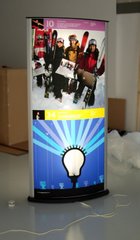
as ever they dont look exactly the same in blogger but you get the idea. He went for a bluey grey rather than the black just to soften the palette slightly. As you saw from my post yesterday the eighties colours in their full potency need careful handling for a show environment so these were softer alternatives but still neon-like. The pink is leaning more to lavender in the ai file here and the grey is darker too. Teal was chosen and we had it in with a 5 colour palette but dropped it by joining together the black and teal and just having 4. Used about 5 different teals before giving up on it for this selection. Another thing to remember is that the lighting will be darker in the show so these colours will need to cut against that.

to see these colours better click on the image and drag it onto your desktop then open in photoshop - they really are wrong when seen in a browser.
as ever they dont look exactly the same in blogger but you get the idea. He went for a bluey grey rather than the black just to soften the palette slightly. As you saw from my post yesterday the eighties colours in their full potency need careful handling for a show environment so these were softer alternatives but still neon-like. The pink is leaning more to lavender in the ai file here and the grey is darker too. Teal was chosen and we had it in with a 5 colour palette but dropped it by joining together the black and teal and just having 4. Used about 5 different teals before giving up on it for this selection. Another thing to remember is that the lighting will be darker in the show so these colours will need to cut against that.

No comments:
Post a Comment