This is the place for any ideas and research for the the level 3 Chelsea College of Art & Design, Graphic Design Communication BA show in London held on the 15th of june 2007.
11/05/2007
last years and this years colours
Last years colour scheme here and some of the ideas for this years scheme all here to help us choose and especially to help us find a colour for the folio. Comments please..
My first choice would be a black porftolio. But having it specially made for you, loses the point, as black is ordinary. I would go for the blueish grey, or the brown family... They work almost as neutral colors, and seem more suiltable to please Greeks and Trojans.
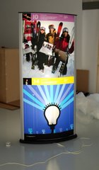
The show has 14 of these 800cm by 1850cm backlit pods - each student has half of one each. They are based on a flourescant light incased in a series of diffusing casings and opal acrylic. In our case the work is then inkjetted onto HP backlit film. Your are supposed to present the non-printed side to the fore but we liked the colourfull printed side better, a final clear acrylic sheet is added to protect the work. These units can take paper as well but I haven't done this yet.
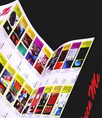
show journal/fold-out
This fold-out poster has student details, projects info and their specialisms on one side and on the other the images from our 80's style fashion shoot. Its B1 folded to B4 and has full gloss laminate to one side an is printed by The Colourhouse house Silk 115 gsm CMYK Staccato Full Colour. To make extra vivid colour we used a process which takes an RGB file and translates this into 6 printed colours rather than 4, firstly Pantone Hexachrome, then Picasso and finally ended up using Staccato.
Folders Galore folios
This year our folios were all made to our spec by folders galore based in london including the inserts which were all A4 wide format (bigger than A4) which gives the benefits of A3 layout without the bulk. Students all get to keep their own and nobody else will have the same style (comes in the range of show colours).
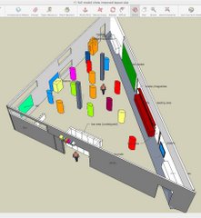
Planning a show like this
In order to make 3d objects quickly and 'fly' round and through the space we uses Google's Sketchup software (free) which saved us time in mocking up layouts nd dealing with 3d objects to scale.


7 comments:
My first choice would be a black porftolio. But having it specially made for you, loses the point, as black is ordinary.
I would go for the blueish grey, or the brown family... They work almost as neutral colors, and seem more suiltable to please Greeks and Trojans.
I vote a deep mullbery colour (not shown) db
I like a4 the deep red, definitely not the average portfolio colour! We might as well go all out.
I agree with Ana, blueish grey could look nice and neutral at the same time.
I'd in with C1... but then if you have seen my website you might understand my bias toward this one. I love it!
actually blogger tends to mess up the colours - they were all a lot more vibrant in pshop.
Haha, Aleister...I'm also feeling C1 the most! Though it probably won't fly with the rest of the class.
Post a Comment